by by Michael Sessions
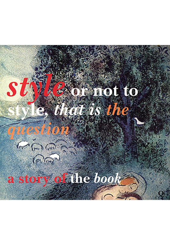
This second edition of the 1992 edition was brought out for the 500th anniversary of the first York Printed Book the Pica, directorium sacerdotum 10th February 2010.
It tells the story of the book from the making of paper in AD105 in the Imperial Court of China. Illustrates the oldest extant book in York c.1020. In appendix one Keith Walls gives a wonderful description of the Pica. In chapters five seven and eight John Smart keeper of the printing section of the Science Museum in 1992 gives a very real insight into the bibliographic workshop still in use at Jackson House, Petergate, York where the publishers and printers of this book, Quacks Books live.
Quacks Books has a long publishing history printing for York Minster as long ago as 1703, the Full Anthems and Verse Anthems collected by Thomas Wanless, Batchelor of Music and Organ at York Minster.
The book is illustrated with many of Quacks Books works and acts as a style guide to aid those everyday typographers of emails, newsletter, websites and books who have not served seven year apprenticeships. The readability of sans serif designer typefaces is discussed with the reader being left in no doubt that book faces with their shaded letters and helpful serifs should be used whenever the typographer wishes the email or book to be read, Baskerville being the preferred typeface.
The over use of Capitals and underlining and the merits of the lower case, italic and bold are discussed, as are the value of the preliminary pages of a book which welcome the reader to the body of the book.
We are all capable of writing at least two books. Quacks Books look forward to hearing from you.


